
Website? It’s Easy If You Do It Smart
Your website, your home page, is perhaps the single most important piece of asset that any business has, and yet, most consultants are squandering it. Let’s talk about something we call the home page journey.
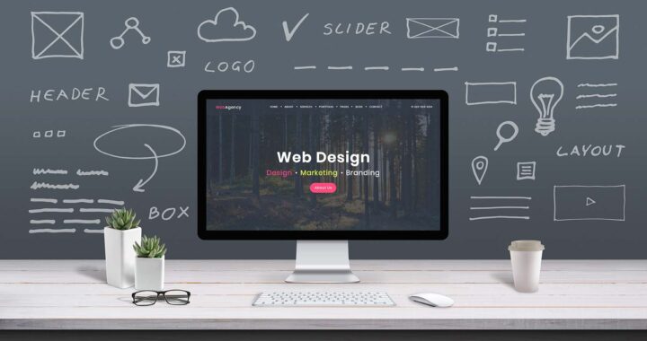
Essential elements of a good website:
Website design, website trends, has changed over the years, and a lot of its driven by the surfer, the visitor’s behavior. Today nobody wants to go to a website, see a glamorous picture that says, “Here’s what we do and we’ve been doing it 20 years. “Click around all these links and maybe you’ll find “what you’re looking for.”
Today the buyer wants to go on a journey on that home page. They want to see if this person knows what my problem is. That needs to be above the fold. They want to see if this person is talking about things that make sense to us, that we like them.
They want to see signals that other people like you and trust you and buy from you and refer you. They want to see that you have significant experience, significant education, and significant certifications. They need those trust markers right there on the home page.
We need content on the home page. We need to show what services or at least the core services that we’re offering, partly because the home page is your best place to rank in Google, and so there needs to be maybe 1,000 words today on a home page that talks about the services that you offer.
Now, you certainly want to have in-depth pages that they can click to and read more, but think about that initial sort of long scrolling visit. It’s like they’re checking boxes off. So, all of these elements need to be there. Obviously today we want to see blog content. We want to jump to social media profiles.
So your home page today has to be designed as one long journey. It’s the overview that helps people know, like, trust, maybe try, because they’re going to find something they can download, and maybe even buy. So, if you think about the buyer journey in that way, that’s really one of the jobs.
Identifying your website’s goal:
The key is to try and be as specific with your goals as possible. The more specific your goals are, the easier it is for us to track the return on investment. So to recap, one of the main questions you need to ask yourself when starting a website.
One of the goals of their website was to increase the conversion rate of the cross-border pickup form. For example, to fulfill that desire why don’t we bring the form to the customer, why not it located right on have the homepage so it is easily be visible all the time.
That’s really what you should be trying to get these users to fill out and that’s what they’ve come here for. So you should try to split that form into a lot smaller pieces as you can see here. And they can just step through each process and simply answer the questions on the page and we tried to keep the form fields down to about three per section.
Clear concise goals from the customer helped drive the development of their website. It’s a good idea to answer these questions before starting your website or your marketing campaign.
The major purpose of any business or a website is to get clients’ attention. Once you get it you will probably be going to get a better suggestion for your business directly from your client. So the main objective of your website should be to get clients’ attention to your niche.
Elevator’s Pitch:
An elevator pitch is a convincing outline of your business you can distribute in the time it takes to peregrinate between floors in an elevator. Regardless of whether you’ll ever give a pitch in an elevator is moot; the authentic benefit is the competency to expound what you do in an intelligible, persuading and convincing way.
Expounding what you do to another person can sometimes be hard. Creating a lift pitch is the ideal method to have a compact depiction of what you do all set whenever the chance to persuade somebody to utilize your item or administrations emerges. Here are a few hints to apply on your website’s home page to assist you with building your lift pitch:
- Start with an interesting question.
- Avoid jargon.
- Know your business.
- Know your worth and don’t undersell yourself.
Website’s Navigation:
Investigating your site ought to be a calm, positive encounter for clients. Your web page’s route can gigantically affect whether your guests have a positive or negative experience on your website and with your brand. Fortuitous for you, you have power over your site route.
Three C’s for an effective site routing guarantee your clients to make the most of their experience and switch forward or backward on your web pages with ease.
These three C’s are:
- Clear: Site visitors anticipate level route over the highest point of your site or vertical route down the left, and their eyes are prepared to filter a site along these lines.
- Concise & Click Friendly: Ensure the most significant website pages are anything but difficult to discover in the essential route. At that point, bunch comparative substance together into classifications that will make up your site’s navigation hierarchy.
- Consistent: Decrease guest disarray by keeping the general look of every website page predictable. Keep your logo in a static situation on each page to keep up a similar look and feel.
Adding Call to Action Button on your Website:
Call-to-action (CTA) buttons you use in your site and on your points of arrival to direct clients towards your objective transformation. It’s the piece of the presentation page that the client needs to click so as to make the move you need them to take. CTA buttons can differ in style and size contingent upon your objective transformation and site style. Some mundane examples of call-to-action buttons are:
- Free trial sign-up buttons
- Add to cart buttons
- Download buttons
User-Friendly CMS & Excellent Visual Design:
A Content Management System, or CMS, is a bit of programming intended to assist clients with making and alter a site. It’s paramount to note, however, CMS does much more than avail manages the text and image content exhibited on web pages. They have advanced to help plan the appearance of sites, track client meetings, handle look, gather guest remarks, and have discussions and a whole lot more.
Avoid Broken/ Dead Links:
Indeed, even the best sites are never totally protected against having broken connections. But the best sites make a standard act of finding and fixing them. Broken connections are those little “troublemakers” that must be gotten before they lead to enormous results. Furthermore, this is a significant piece of site improvement.
Here are a few choices for fixing your wrecked connections:
- Update all connections prompting it.
- Erase all connections prompting it from your substance, or discover something comparative worth connecting to.
- There might additionally the issue of outer connections perhaps prompting them. This can be found with back link examining instruments.
- For a connection included with grammatical errors or different mix-ups, it is suggested to make redresses.
Key is to organize your content:
However, other than watching that your web content is helpful, viable, and elegantly composed, you have to ensure that it is likewise plainly sorted out. Your guests should have the option to rapidly check your site and locate the substance they are searching for. This isn’t a simple assignment because there are various individuals visiting your site, and every one of them has various desires.
Over to You:
Rather than compelling yourself to receive a totally new work process or set of authoritative propensities, consider exploring different avenues regarding various devices and afterward attempt to coordinate them with your current propensities. There is no single right approach to keep your website composed, yet there are a lot of tips and tricks you can fuse into your website to improve efficiency and keep you sorted out.