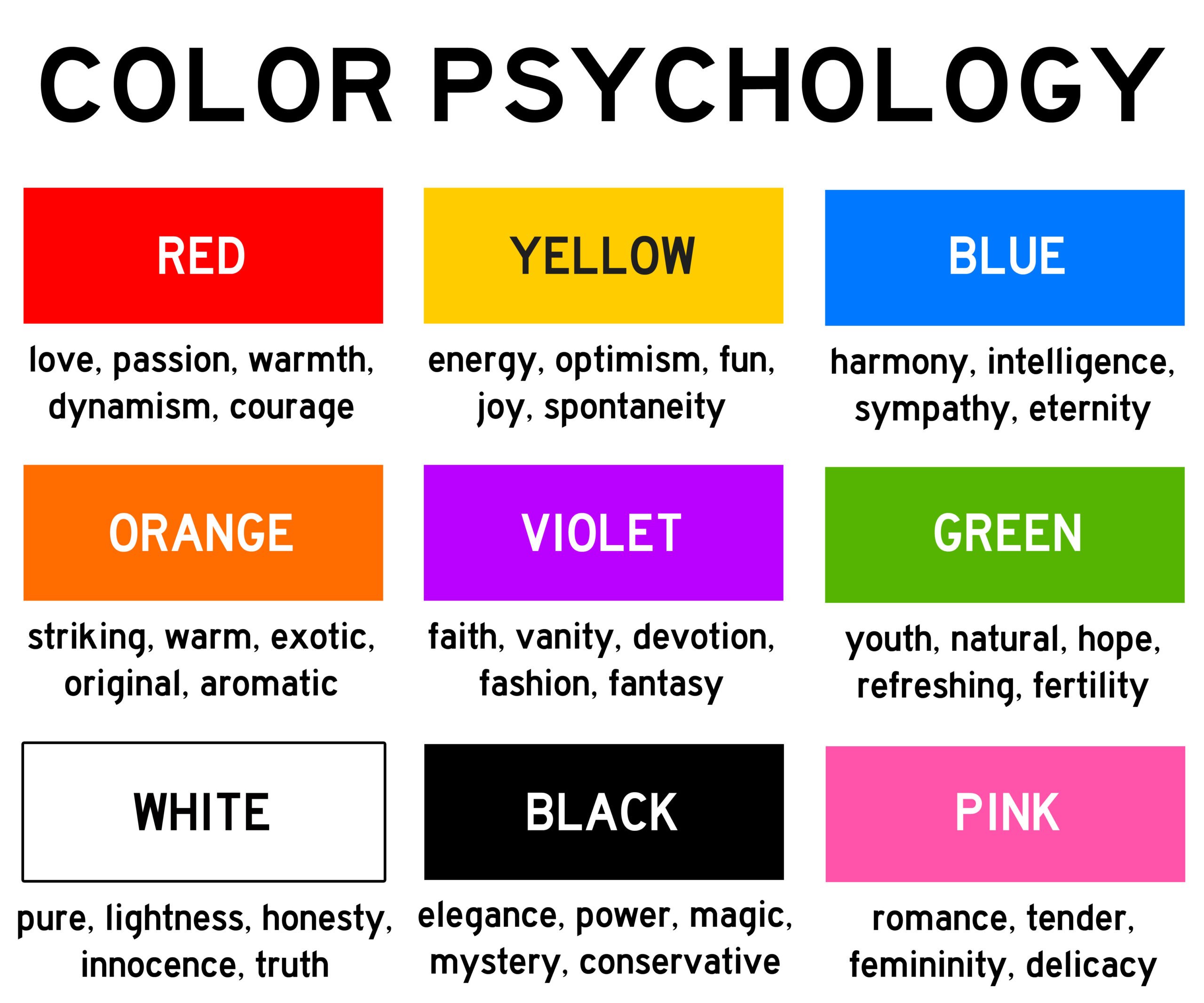
Logo Color Psychology — How Colors impact Emotions
Logos don’t get their colors at random. A whole lot of research goes into designing a logo to give it a conscious and subconscious meaning the brand is supposed to deliver. All the shapes, writing, design, and other aspects of a logo are immensely important, but the single most powerful aspect of a logo is its color. It acts more on the subconscious part of the mind than on the conscious part and implant an idea deep down in the mind of the one looking at it.
Colors are proven to be very powerful, so powerful indeed that they can influence the way a person thinks and reacts, and even stimulate the release of some bodily hormones that in turn impact the whole thought process. Colors hold an array of meanings, and the meanings and emotions related to color might vary across different cultures and people, but the importance of colors and choosing the right colors for the right job can never be overemphasized. With that said, let’s have a look at how different colors impact the message the logo of a brand portrays.
White
White is regarded to be the color of peace, tranquility, since the beginning of time. It is seen in logos like the WWF and is usually utilized in reversed text or negative space. Logos that belong to brands focused on cleanliness, innocence, peace, and purity use white color.
Yellow
Yellow color can deliver several messages depending on the shade and the region/society it is used in. Mostly, this color is associated with attracting attention because of being bright and highly visible. The yellow color is known to create a feeling of joy, cheerfulness, and warmth.
Red
This intense color shares roots with blood and also with love. The bright color is used to attract attention and stimulate strong reactions, ranging from blood and warfare to love and intimacy. This color is also known to trigger hunger, and that’s probably why this color is used in the logos of food chains like Burger King, McDonald’s, and KFC.
Orange
This color is an amalgamation of the colors yellow and red and has the attributes of both of them. It is used to grab attention and create a sense of warmth and playfulness. It is used in logos to stimulate emotions and even hunger.
Pink
Universally regarded as the feminine color, this color is used to add a touch of innocence and delicateness in logos. This color, almost across the whole human population, conveys the messages of femininity, delicacy, appreciation, and innocence.
Purple
This color is associated with royalty, mystery, sophistication, and spirituality. As this is a color derived by combining red and blue, it has properties of both of them. It usually sends the message of luxury and perfection. You can find this color on various educational institutions’ and luxury brands’ logos.
Blue
A calm and peaceful color; it gives the feeling of authority, security, and success. Almost everyone likes one or another shade of blue. It is found in logos of government agencies and Fortune 500 companies.
Green
This is the color of life and renewal. It is found in the logos of the companies trying to portray themselves as environmentally responsible.
Grey
Grey can be regarded as an emotionally and psychologically neutral color. It does not portray any specific meaning and is used to complement other colors in a logo. Some iconic logos that don’t feel a need to involve emotions in their deal, like the jewelry brand Swarovski, use this color.
Black
This color is known to portray menace or evil and is a powerful expression of power and ability. It is used in logos to make them intimidating, powerful, bold, simplistic, and sophisticated. You can find it on the logos like 007 that are aimed to assert power and domination.
Summing-up:
In the end, it is important to note that the meaning of color in one culture might not be the same in another society. Moreover, different tints, shades, and hues of the same color also have different effects. It is also crucial to select the right color for a logo, and if you can’t do that or not have experience in this filed, you should rather hire the services of professional logo designers than messing up the logo and ending up sending a subconscious meaning that is not in line with the objectives of your brand.

